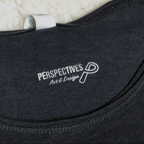
Perspectives Art & Design was created by Co-Owners, Alyssa Scaduto and myself. The Perspectives logo is about expression and being opening to new ideas. The monoline icon is a play on words and is put into perspective while keeping the pathway open for those new ideas. The weight carried by the icon holds the same weight as Perspectives, while the secondary type nested between the two, brings personality.


The Unsolid logo is a wordmark created by modifying a typeface. Similar to the glassblowing process the wordmark provides constant movement with its open passes. The rounded characters explore the shaping phase in the glassblowing process.


Working with one other student and a mentor, we developed a variety of unique logos for one to take on the new identity of School District 51. All logos are flexible and responsive in all workspaces. School District 51 Mesa Countv Vallev's logo redesign is currently on hold!
Click the button below to see all the options
and our progress.


The Poor Decisions logo uses typographical contrast and a two-shape icon to stand out from its competitors. This testimonial podcast brings the people, their voice and a positive message in the logo. These colors play on the emotions of the listener for they are related to color psychology.


The Woo-Hoo's logo plays on the entertainment it provides. The typography is inspired by the shapes found inside the arcade. The icon resembles a joystick which is a key component
for arcade games. Together this mark uses vibrant eye-catching colors to match the energy resinated with the company.


